Mobile is a word you are hearing a lot about lately, because Google decided to drop websites that are not mobile friendly. Well, they didn’t drop them altogether, but they no longer let them show up in the first several pages of search engine results. If your website is not friendly on mobile devices then in April you were kicked down to the end of the road.
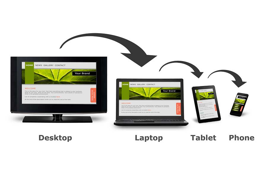
Mobile
The word mobile is used when talking about devices that are not chained to your desk. They include smartphones, tablets and other devices that connect by Wi-Fi or cell service. If you have ever browsed websites using your cell phone then you are probably familiar with why Google is penalizing some companies for not writing their site with mobile in mind. Unfriendly websites will have tiny print and navigation that doesn’t work or respond. All in all, it is a very frustrating experience. Don’t be one of those companies.
Mobile Friendly Test
If you do not know how your website looks on mobile, like a smartphone or tablet, Google has developed a quick test. Go to their Mobile Friendly Test website and enter your url into the box. Click the “analyze” button. In less than a minute you will have the results to let you know if your website works well on mobile.
If you passed, wonderful! If not, give us a call and we’ll help you solve the problem. But, even if you passed the mobile friendly test, you need to look at your website on a mobile device to see if it looks like you want it to look. Is your website helpful to your customers? Is it giving out the information you need it to in order to attract new customers? It isn’t just passing the test that is important. You must have a website that works to get customers into the door of your business.
Recent Comments